Cumulative Forecasts and Measuring Impact
If you have a really good forecasting model that has, historically, produced good results then you can use it to estimate the effect of a change.
For example, physicists can use Newtonian Physics to forecast where planets will be in the sky and things like solar eclipses. If these predictions suddenly started being wrong (after they have been right for hundreds of years) people would conclude that something fairly drastic had changed.
Similarly, if you have made a good forecast in Forecast Forge but then it starts predicting badly this could be because something has changed. You can turn this reasoning around and also say “if something has changed then the forecast won’t work as well.”
You can watch a quick video of me demonstrating how you can do this in Forecast Forge. Or read on below for more details and commentary.
Look at this example of daily transaction data:
![]()
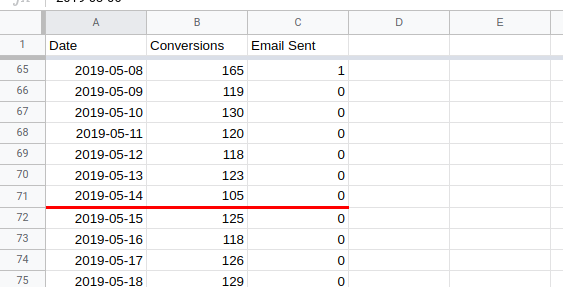
On the 14th May a small change was made to the site; the last 30 days of data are from after this change was made with the rest of it being before.
The other important thing to note is that the spikes in traffic occur on the dates that emails are sent; this is roughly every two weeks but real life being what it is it isn’t exactly every 14 days.
![]()
The question is: Did the change make a difference?
I won’t walk through all the ins-and-outs of building a forecast to answer this question right now but I will show you an example of how it does and doesn’t work.
You can follow along in this Google Sheet.
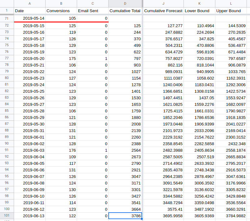
I start off with three columns of data; the date, the number of daily transactions and whether or not an email was sent on that day. The third column will turn out to be quite important for this analysis. You might not need it when you run your own (and you might need something else instead).
I’ve also marked the date of the site change with the red line to make things a bit easier.
The big idea here is that we can use the first 70 days of data to make a forecast for the final 30. Then we’ll compare the forecast against the actual values.
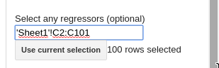
In this example, I will use the sidebar:

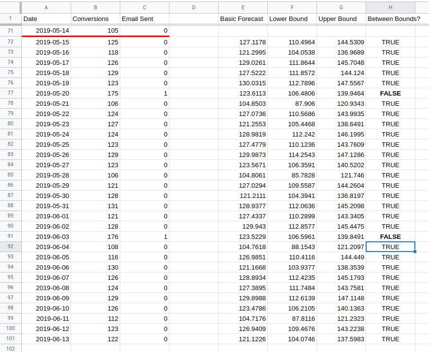
You can see the results in columns E, F and G in the spreadsheet.
In column H I have checked to see whether or not the actual value lies between
the lower and upper bound. In all except two cases it does.
So this means the test has failed and made no significant difference right? No!
The analysis so far looks only at a daily comparison; the expected value of a die roll is 3.5 but
- You will never observe this value not matter how many times you roll
- Rolling a single 6 doesn’t tell you very much about whether you are looking at a fair die or not
To get a proper answer from looking at the daily data would require some quite complicated combining of probabilities and controlling for extra factors. I’m all for getting into the weeds of an interesting analysis but when I do this I like to make sure I’m actually answering a question that people care about.
In this case businesses generally don’t care about the day to day variation for a site change; they want to know if it is better overall. And for this you need to look at a forecast for the total over the whole of the test period.
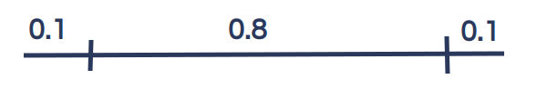
It is easy to calculate the expected value for this; it is just the total for the daily estimates. But calculating the predictive interval is much harder. For example; for the lower bound of the default predictive interval, there is a 10% chance each day that the true value is less than the bound. This happening every day for seven days would only have a 0.1^7 chance of happening (0.00001%) which is a much wider predictive interval than that of the daily estimates.
This would lead you to reject good site changes, thinking that they weren’t likely enough to be a true positive change. It is important to get the predictive interval right when trying to estimate this kind of thing.
Forecast Forge offers you two ways of doing this:
- A custom function called
FORGE_CUMULATIVE_FORECAST - A menu option in the sidebar which I will show you now.
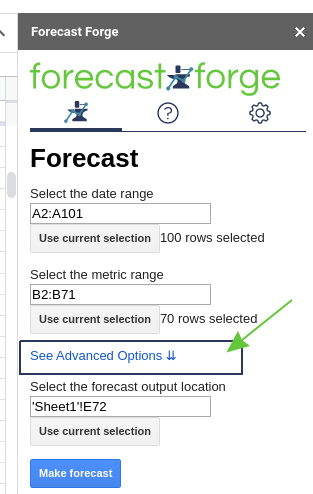
You must open the “Advanced options” menu if you haven’t already.
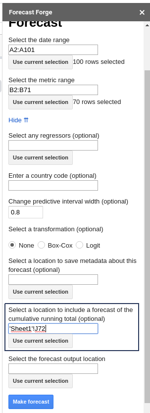
Enter the location where you want the cumulative forecast to save and then click “Make Forecast”.
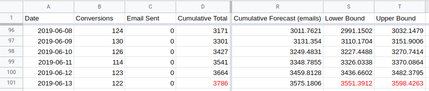
You also need to know the cumulative total for the test period. I’ve put this in
column D.
The end result will look something like this:
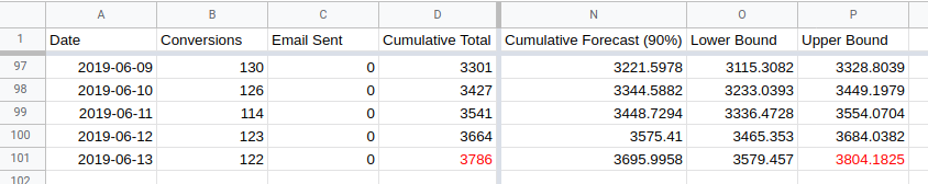
The actual cumulative total of 3786 (in cell D101) is higher than the upper
bound for the forecast cumulative total of 3785 (in cell L101). This indicates
that the change made on the 14th May has had a positive impact.
But wait…
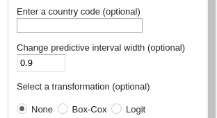
The default predictive interval width in Forecast Forge is 0.8. Which means there is only a 90% chance of this being a valid result.
For some reason people have an obsession with a 95% chance. To get this in
Forecast Forge you need to change the width of the predictive interval from
0.8 to 0.9.
When you rerun the forecast after changing the interval width the actual value
is within the predictive interval (See cells O101 and P101).
But wait…
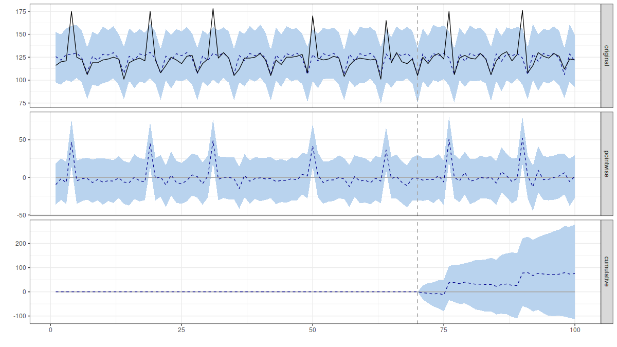
This only works if you have a good forecast. And in this case the main source of variation in daily transactions is whether or not an email was sent that day.
At the moment the forecast algorithm sees days on which emails were sent as large random variation which happens for no reason. So it learns that this data has a lot of large random variation in it. Which means it expects this to continue in the future so the predictive interval is very wide.
The solution? Add the email dates as a helper column.
This forecast will have a much narrower predictive interval.
The actual total is well outside the forecasted values (even with a 0.9 width predictive interval) so just about anyone would conclude that the changes made on the 14th May did have a positive effect.
Comparison with CausalImpact
This approach is basically the same as the one used by Google with their CausalImpact package for R.
The big difference is that I use a different forecasting algorithm to the one they use by default.
Their algorithm has exactly the same problems when it gets the daily transaction data alone:
When the email dates are included too it looks like this:
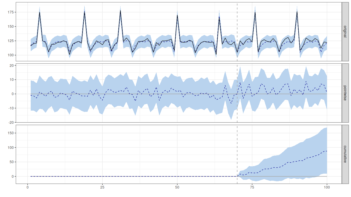
The package reports a 98% chance of a positive effect.