Anomaly Detection in Google Sheets
What is Anomaly Detection?
Anomaly Detection is identifying “anomalous” data.
Usually it means using machine learning to identify outliers but you can do anomaly detection with any v1.0 human eyeball too.
Aside from all the complexities of machine learning an important difficulty is knowing what an anomaly is. Sometimes it is entirely expected to have some data that is very different to the rest.
Forecast Forge is focussed on timeseries data; data where each observation is associated with a specific time. An anomaly is then where an observation is very different from what we would expect given the trend and seasonality in the data.
Anomaly Detection with Forecasting Algorithms
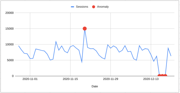
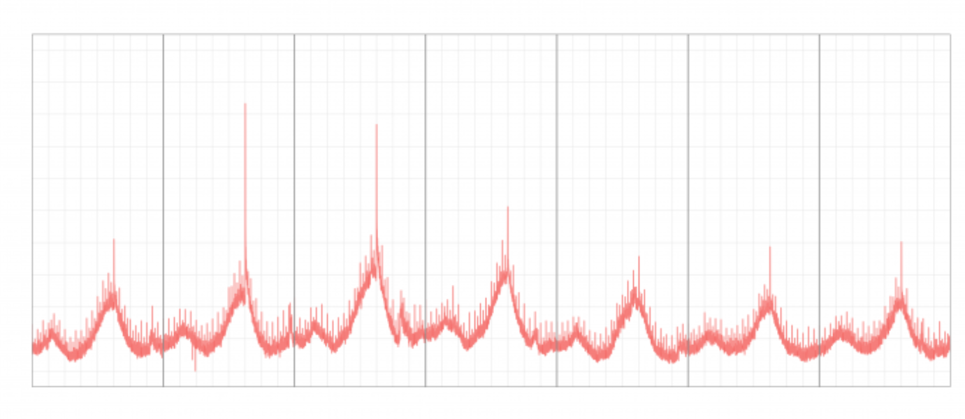
One way to do anomaly detection is to make a forecast and then look for any points that lie outside the forecast interval.
For example, I can make a forecast with a 95% interval for the next 7 days and I know that there is only a 5% chance of any individual day falling outside the forecast range.
[Be aware that this adds up to a 30% chance of getting 1 anomaly per week]
In the example on the left there are two anomalous days that fall outside the predictive range.
Disadvantages of using Forecasting Algorithms
There are two main disadvantages to this approach, one of which applies only to Forecast Forge and one of which is a more general weakness.
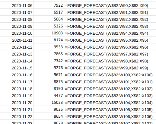
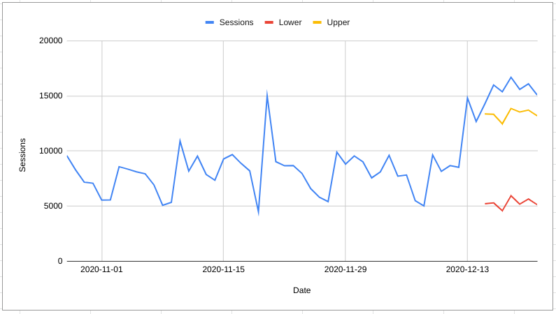
The predictive interval for a forecast gets wider and wider as you move further into the future. This means that many results that would be categorised as anomalous if they happend after one day would not be categorised as anomalous if they happend after 100 days.
The solution to this is normally to make many short term forecasts. For example take data from the first 100 days and forecast day 101, then take data from the first 101 days and forecast day 102 etc.
This approach is much harder to do in a spreadsheet (although I’m sure some of you #madlads will try it)
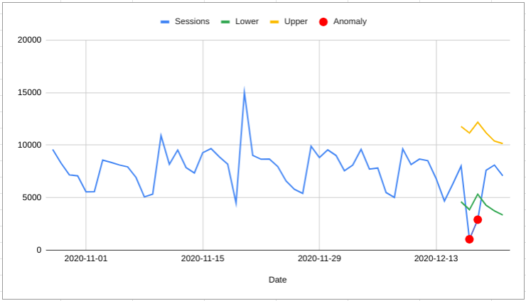
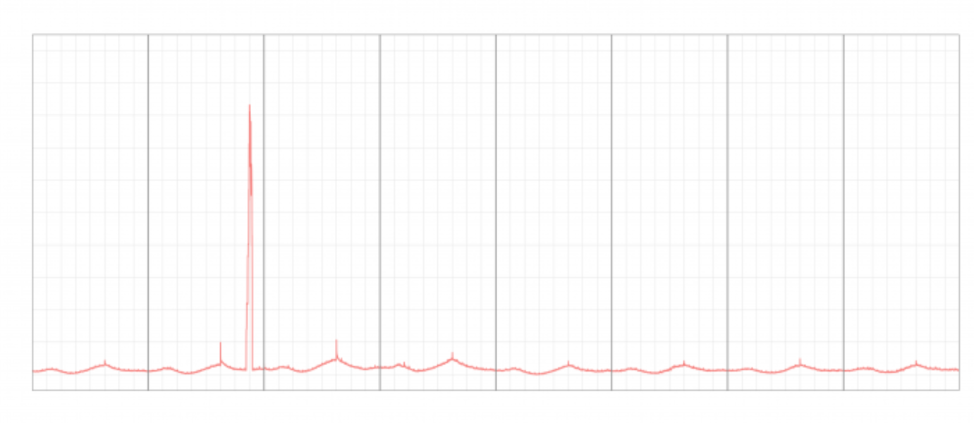
The forecast can only identify anomalies looking forwards. Sometimes some context around what was happening previously can help make a better judgement
For example, in the chart on the right all of the last seven days of data would be classified as anomalous. But, seeing all the data in context it could also be a sustained increase in sessions.
This gets right into the semantics of what we mean by “anomaly” (if it was the same thing, but zero sessions you’d definitely want to be alerted that the tracking was broken!). But the point is that the forecast method treats this kind of thing very differently.
Specific Algorithms for Anomaly Detection
Forecast Forge uses a technique called Seasonal Hybrid Extreme Studentized Deviates (S-H-ESD) which was developed at Twitter for detecting anomalies within their systems.
Seasonal means that a seasonally recurring high or low won’t be flagged as an anomaly. This algorithm doesn’t learn seasonal effects as well as the forecasting algorithm does, but it is certainly better than a non-seasonal algorithm.
Hybrid refers to using the median rather than the mean for some calculations within the algorithm. This means it can work with timeseries with lots of anomalies. Outlying values have a large influence on the mean so if there are quite a lot of them then they might not be classed as anomalies. Or worse, everything else might appear to be anomalous!
ESD has been used for anomaly detection since 1983. You can read more about it. It works better than some other options because you don’t need to specify the number of anomalies in the data in advance.
For more information about this algorithm you can read the paper describing it or checkout the github repository of Twitter’s implementation of the algorithm. This is what Forecast Forge uses behind the scenes.
Anomaly Detection in Google Sheets
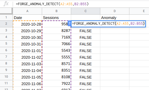
Anomaly detection in Forecast Forge is provided by the
FORGE_ANOMALY_DETECT function. It takes up to four
arguments:
- A column of dates
- A column of numbers - this is the thing you want to detect anomalies in!
- (optional) The maxium proportion of anomalies you expect to
find. For some data, the algorithm might think that a very large
proportion of it looks anomalous. This value helps you control
the number of anomalies returned. The default is
0.1which means only the 10% most anomalous results will be flagged if the total number of anomalies is more than 10%. - (optional) An alpha value which is the significance
level for the anomaly test. The default value is
0.05; higher values will result in more anomalies being flagged, lower values will result in fewer.
The output is a column of TRUE/FALSE
values, one for each day. A TRUE value indicates an
anomaly and a FALSE value is where no anomaly has been
detected.
Displaying the results in a chart
After running FORGE_ANOMALY_DETECT you will have a
column of TRUE/FALSE values. How do you
turn this into a nice chart where the anomalies are highlighted?
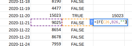
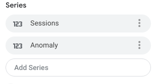
- First make a new column containing blank cells when there is no
anomaly and the value of the anomaly when there is an anomaly.
If you data is in column
Band the results of your anomaly detection are in columnCyou can do it with this formula=IF(C2,B2,"") - Add your new column to the chart
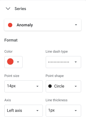
- Customise the series for this column to show large, circular points at every anomaly. If you have a few days of consecutive anomalies then you might also want to reduce the line thickness and change to a dotted line too.