Understanding the Forecast Decomposition Report
Forecast Forge uses what is known as a structural time series model for forecasting which means that your forecast is made up of the sum of several components. For Forecast Forge there are three types of component:
- Trend
- Seasonality
- Regressors
Sometimes you will see a forecast and be confused about why it is predicting what it predicts. Or you think the forecast is bad but you aren’t sure what it is you can do about it.
Being able to see what Forecast Forge has learned for each component can help you with both of these problems but this information was not available… until now!
![]()
When you create a forecast in the sidebar you will see a link that you can click to see more information about the separate components that make up your forecast. Here is an example for the All I Want for Christmas is You forecast I made in November of last year.
Overall Chart
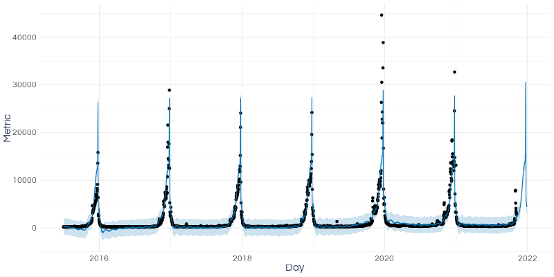
The first chart in the report shows the values of the forecast as well as what the forecast would have predicted during the training period.
Things to look for here:
- Are there periods with a large number of outliers? Can you identify what was going on during these periods?
- Is the predictive interval during the training period (the pale blue band) very wide? This indicates either a lot of randomness in your data or the existence of patterns that the forecasting algorithm is failing to learn
- Whether the forecast seems resonable in context (you don’t need this report to do this and you should be doing it anyway with charts in Google Sheets)
In the Mariah Carey forecast image I can see lots of outliers around Christmas 2020 and 2021. It also looks like for most of the year (i.e. outside of December and maybe November) the predictive interval is far too wide. These two observations could be linked because outliers can teach the algorithm that the data is more random than it actually is - this means it then increases the width of the predictive interval to allow for this.
Trend Chart
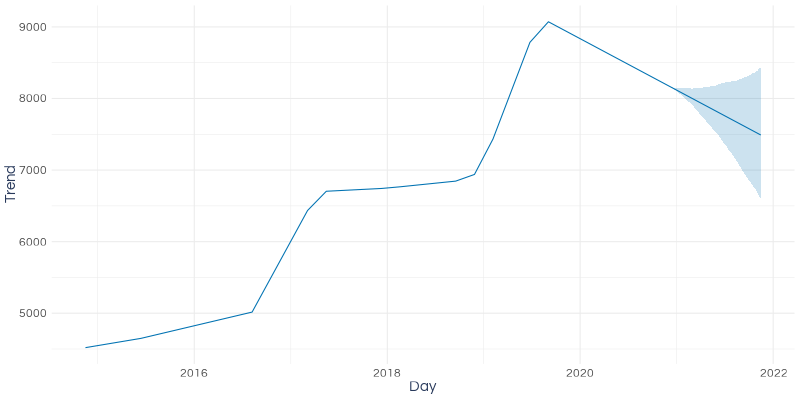
The trend represents the longer term patterns in your data adjusted for any seasonal variation and for any regressors.
Forecast Forge uses a piecewise linear trend which means the trend is made up of a series of straight line segments. The most recent of these segments is extended into the future to make the forecast. The uncertainty interval allows for the possibility of the trend changing in the future; this is learned from how much the trend has changed in the past.
In the example above the trend has changed quite often and by quite a large amount so the predictive interval for the trend widens quite quickly.
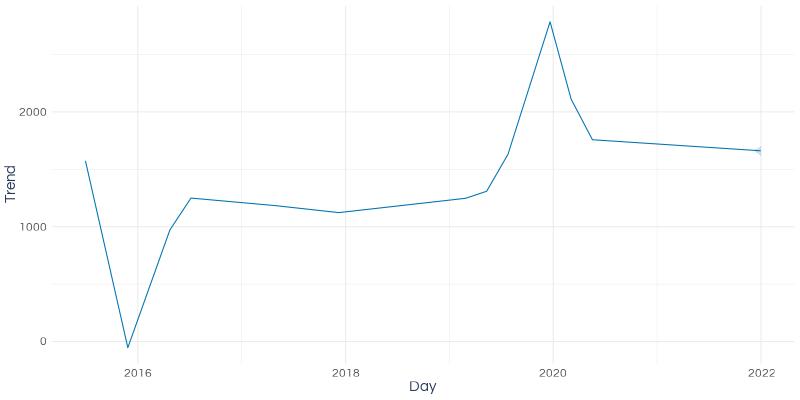
For the Mariah Carey forecast (pictured above) there has also been some large changes in the trend, but the forecast period is so short that the predictive interval for the trend remains narrow. Also, if you look at the size of the figures on the y-axis you can see that the trend is not very important for this forecast; at most it contributes about 2800 daily sessions.
Things to look for in the trend chart:
- Can you identify what was going on in the business near the points where the trend changes? Don’t worry if you can’t, but if you can this could be useful insight to share.
- Forecast Forge ignores the most recent data when estimating the trend. This is to prevent a few randomly good days being interpreted as a trend change which would then be extended into the future leading to an overly optimistic forecast. But this means that if your trend has changed recently then Forecast Forge will miss this.
- The trend line (ignoring the predictive interval) is a straight line. Is it resonable to assume this will continue for the duration of your forecast? If the trend is for rapid growth and you’re forecasting 10 years ahead then I would suggest not. The shorter the period you are forecasting for the less likely this is to be a problem.
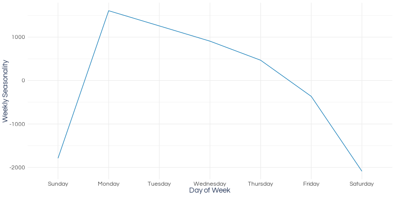
Seasonality Charts
Forecast Forge estimates two seasonal components:
- Annual - which looks for patterns which recur every 365 days
- Weekly - looks for patterns which recur every 7 days

Forecast Forge tries to smooth this pattern out to prevent accidentally mistaking a one off event as part of a repeating pattern. The downside is that this limits how “spiky” a pattern it can fit. If you have an annual pattern where some days are very different from the days either side of them you should use a regressor column for better results.
In the Mariah Carey example we can see three things:
- The seasonal peak in December is far too low; only 5.5k sessions when we should expect something over 20k at peak
- The peak is too broad; spread out over most of the month (and into the first part of January) rather than being concentrated in a few days before Christmas
- The peak is at the wrong time; it should be much later in December
All three of these problems are because of the annual seasonality smoothing.
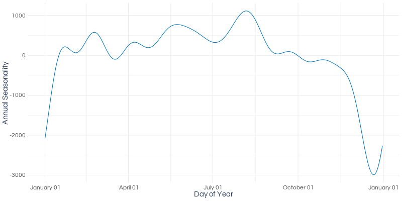
The example above shows a different pattern with a slight peak through the summer months and a trough through December. The fitted model would show traffic rising after Christmas a little bit too early - in reality it should stay low until after New Year - but this is still much better than the Mariah forecast.
The algorithm always has a lot more data on the repeating weekly pattern than on the repeating annual pattern so you normally don’t have to worry so much about weekly seasonality.
It is important to note that the Forecast Forge algorithm assumes that both of these seasonal patterns will stay the same in the future. If, for example, you are in a sector where people are ordering earlier and earlier in the year then Forecast Forge will not automatically recognise this pattern.
Regressors
Adding your own regressor columns is an awesome way to help the algorithm make a better forecast. I’ll show you more about manually added regressor columns later, but first I will show you the most commonly used set of regressors; country holidays!
When you enter a country code then behind the scenes Forecast Forge looks up a
database of holidays for that country and adds a regressor column for each
holiday. This is a binary regressor with a 1 on the day of the holiday and a
0 on other days.
The holiday chart shows the effect of all these holidays.
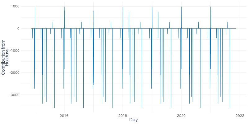
In the example above (UK holidays) most of them have a negative effect on website traffic.
These charts make it very obvious that the effect of a holiday is applied only on the day of the holiday and not in the days or weeks preceding it. If you have a holiday that is very important for your business then you will likely see increased traffic/sales in the run up - but this will not be modelled by the default holiday effects. This pattern might be learned by the annual seasonality component but if it isn’t then you’ll have to add a manual regressor column (or columns).
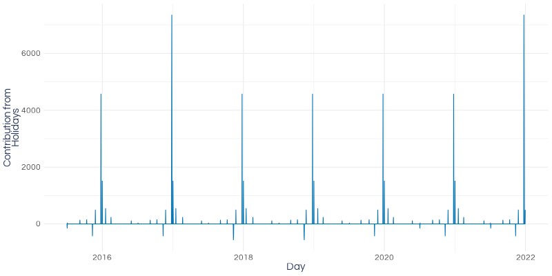
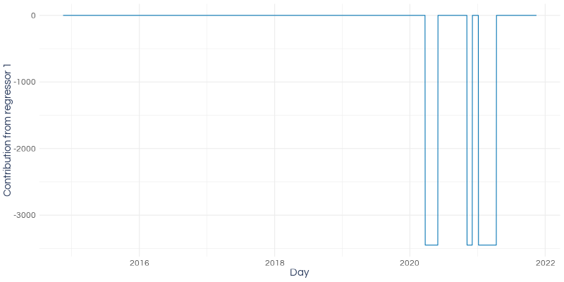
For manual regressor columns you will first see a chart showing the combined effect of all your regressor columns:
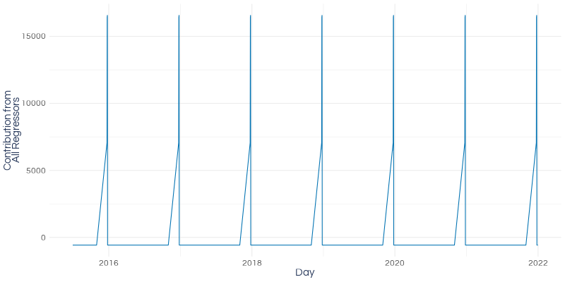
And then charts for each regressor individually. If you only have one regressor column then you’ll see two charts the same.
Forecast Forge doesn’t get to see your column headers so the regressors are
named Regressor 1, Regressor 2 and so on. Regressor 1 is the leftmost
regressor column in your spreadsheet and then Regressor 2 is the one to the
right of it etc.
Data Transforms
To plot all the charts in this post the forecast needs to be split into it’s component parts. This can only be done after any data transforms have been applied.
Remember that, for the data sent to the forecasting algorithm, forecast = trend + seasonality + regressors. This means that it is normally not possible
to run the inverse transform on each component and then add them up to get the
same value as the inverse transform of the forecast.
For example log(trend + seasonality + regressors) does not equal log(trend) + log(seasonality) + log(regressors) and this relationship also does not hold for
the other commonly used transforms (logistic and Box-Cox).
This means that the decomposition charts will all be on the scale of the transformed data, not your original scale.

In conclusion, I hope this new feature will help with three things:
- More transparency about what is happening internally will increase your confidence in your forecasts
- It will make it easier to explain your forecasts to stakeholders
- If a forecast doesn’t look right it will help you to debug and improve it